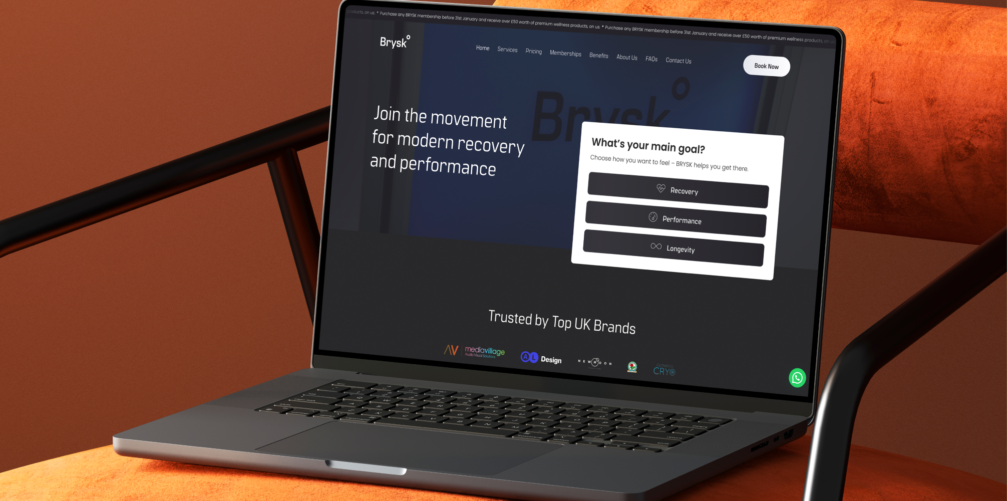
Brysk is a good example of a challenge many service businesses underestimate online: if the offer is unfamiliar, the website has to do more than look polished. It has to help people understand what the business actually does, how the services differ, and which path makes the most sense for them.
That was especially important here. Brysk sits at the intersection of wellness, recovery, performance, and lifestyle. For many users, interest is there before understanding is. They may have heard of cryotherapy, seen red light therapy on social media, or come across hyperbaric oxygen through sport or recovery content, but they do not necessarily arrive ready to choose.
That changes what the website needs to do.
This article looks at how the Brysk website was structured to turn curiosity into clarity, and clarity into action – from homepage routing and service architecture to trust content, supporting blogs, and conversion pathways.
🔑 Key Takeaways
- Premium design alone is not enough: when services are unfamiliar, the website must actively guide users towards understanding and action
- Homepage structure matters: the homepage should introduce the brand, establish trust, and route users into the right next step
- Service pages need practical clarity: users need help understanding what each treatment is, who it may suit, and what to expect
- Support content reduces friction: comparison pages, safety content, and educational blogs help people move forward with more confidence
- Good structure improves more than SEO: it also strengthens engagement, trust, and conversion performance
🧭 Jump to:
A premium website still needs clarity
One of the easiest mistakes to make with a premium brand is assuming the presentation can do all the work.
A clean visual identity, strong photography, and a polished user experience all matter. They help shape trust quickly. But if a business offers services people do not fully understand yet, design has to be supported by structure and explanation.
That was part of the challenge with Brysk. The brand needed to feel modern, calm, and credible, but the site also had to explain the value of each treatment clearly enough for users to take the next step.
For brands like this, structure is not just a design decision. It is a commercial one. If the user cannot quickly work out what is relevant to them, they hesitate, bounce, or keep browsing without ever building enough confidence to enquire.
The homepage starts the journey
A homepage should not try to do the entire sales job on its own.
Its role is to:
- Introduce the brand clearly
- Establish trust and tone
- Give users a sense of the service range
- Route them towards the right next page
That is especially important for service businesses with multiple treatment options. Brysk’s services page and homepage structure work together to help users move from broad interest into a more specific path.
Instead of assuming the visitor already knows exactly what they want, the site needs to support the more common reality: they are curious, but still working out which option best fits their goals.
That change in mindset affects everything from navigation and hero messaging to service summaries, trust sections, and internal links.
Service pages should answer real questions, not just describe the treatment
Once a user clicks into a service page, the job changes.
At that point, they no longer need a general overview. They need practical clarity. A good service page should help them understand:
- What the treatment is
- Who it may suit
- What happens during a session
- What makes it different from other options
- What to do next if it feels relevant
That is why individual service pages matter so much for brands like Brysk. A user interested in whole body red light therapy is not behaving in the same way as someone exploring hyperbaric oxygen or looking into compression boots after training.
The website needs to respect that difference.
If everything is forced into one broad page, users are left to do too much interpretation themselves. If each service has its own structured destination, the business can match the page to the question more precisely and reduce decision friction.
Support content builds confidence before the user is ready to commit
Not every user is ready to enquire the first time they land on a service page.
Some need more context first. They want to know what a session feels like, whether a treatment is safe, how different options compare, or which service may suit their situation best.
This is where support content becomes commercially useful.
For Brysk, that means educational pages and blogs can do important jobs such as:
- Explaining what happens in a session
- Answering practical concerns
- Clarifying suitability and expectations
- Helping users compare services more confidently
A page like How to Choose the Right Brysk Session supports that journey well because it helps users move from general interest into a more informed decision.
The same applies to trust-focused content like safety and contraindication guidance. For businesses in wellness and recovery, that kind of content does not just “help SEO”. It helps people feel looked after before they ever book.
Better structure creates better engagement signals before it creates more conversions
One of the reasons website structure matters so much is that users show you very quickly when a journey is clearer.
Before you see the full commercial impact, you often see movement in earlier behavioural signals:
- More interaction with key sections
- Deeper navigation into service content
- Lower bounce rates on priority pages
- Stronger alignment between page intent and user behaviour
That was part of the logic behind the Brysk build from the start. The goal was not simply to create a brand-led website that looked right. It was to create a structure that helped users understand the offer more quickly and move through the site with more purpose.
For unfamiliar or emerging service categories, that matters even more. When clarity improves, engagement improves. When engagement improves, conversion pathways become far more realistic.
Destination-led brands need stronger trust and navigation than emergency local services
Not every local business is chosen in the same way.
Some are urgent, convenience-led, and hyper-local. Others are more destination-led. People will travel if the brand feels worth it, the service is well explained, and the experience feels trustworthy.
Brysk fits the second category.
For brands like this, the website has to do more than prove the business exists. It has to reduce hesitation. That means:
- Clear service discovery
- Calm, grounded messaging
- Reassuring support content
- Strong visual presentation
- Easy pathways into enquiry or booking
This is also where pages like localised cryotherapy become important. They do not just exist to capture one phrase. They help the business present a fuller, more understandable treatment ecosystem to users arriving with different needs.
How the Brysk site links together matters just as much as the individual pages
Strong websites are not built from isolated pages. They work because those pages reinforce each other.
For Brysk, that means the structure should help users move naturally between:
- Homepage and services hub
- Service pages and related services
- Educational blogs and commercial pages
- Support content and decision-focused content
That kind of internal pathway matters for both users and search engines. It helps people keep exploring when they are not ready to act immediately, and it helps clarify which pages represent the core treatments the business wants to be known for.
When this is done well, the site becomes easier to expand too. New service content, new comparison pages, and new educational pieces can all feed into the same commercial architecture instead of sitting off to the side with no clear role.
What other businesses can learn from this approach
Brysk is a strong example of something many service businesses face: users may be interested before they are informed.
That changes what the website needs to do.
The lesson is not just “have a nicer website”. It is:
- Structure pages around real user decisions
- Give each core service room to explain itself properly
- Use support content to reduce uncertainty
- Make internal pathways deliberate
- Treat clarity as part of conversion, not an afterthought
That is where good design, good messaging, and good website strategy start working together.
FAQs
Why does website structure matter so much for wellness and recovery brands?
Because users often do not arrive with full understanding. They may be interested in the outcome, but not yet clear on the treatment itself. Good structure helps bridge that gap and reduces hesitation.
Should every treatment have its own page?
Not automatically, but if a treatment has distinct user intent, different questions, or a different decision-making journey, giving it its own page usually makes sense. That is especially true when people search for specific services individually.
What role should blogs play on a service-led website?
Blogs should support the main commercial pages, not compete with them. The best ones answer real pre-booking questions, reduce uncertainty, and guide users towards the most relevant service page.
Is a premium-looking homepage enough on its own?
No. A strong homepage can shape trust and route intent, but it still needs supporting service pages, trust content, and clear next steps if the business wants users to move from browsing to enquiring.
How do you make unfamiliar services easier to understand online?
Usually by combining clear service pages, support content, FAQs, comparison content, and deliberate internal linking. Users rarely need just one page. They need a structure that helps them build confidence across multiple steps.
Next step
If your business offers services that people are interested in but do not always fully understand, website structure matters more than most teams realise.
👉 If you want a website that does more than look polished, explore our web design and development services or contact Media Village to discuss how structure, messaging, and user journeys can improve clarity, trust, and enquiries.