Hoodies 4 Schools
Spacing and Layout
Before and After
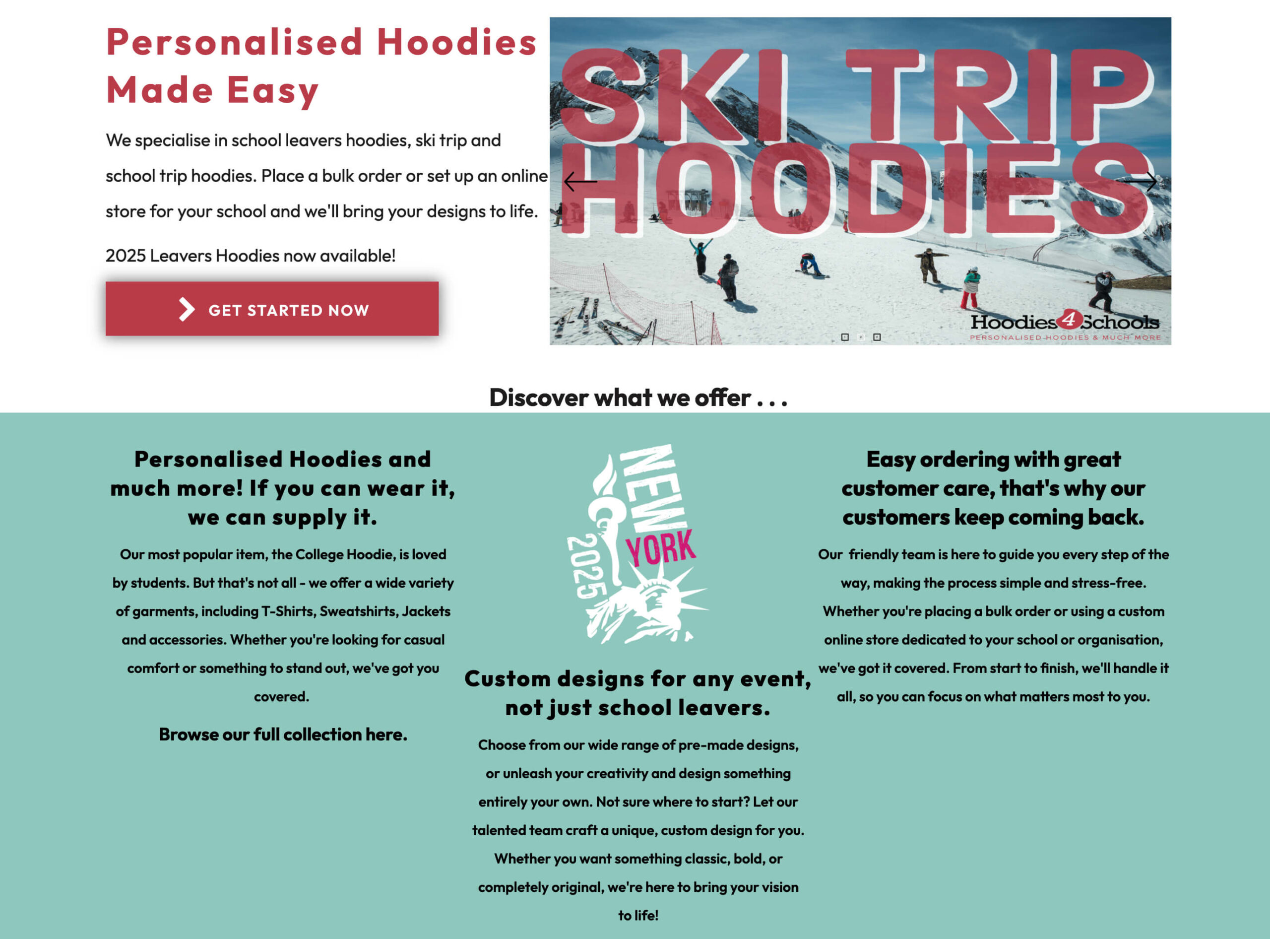
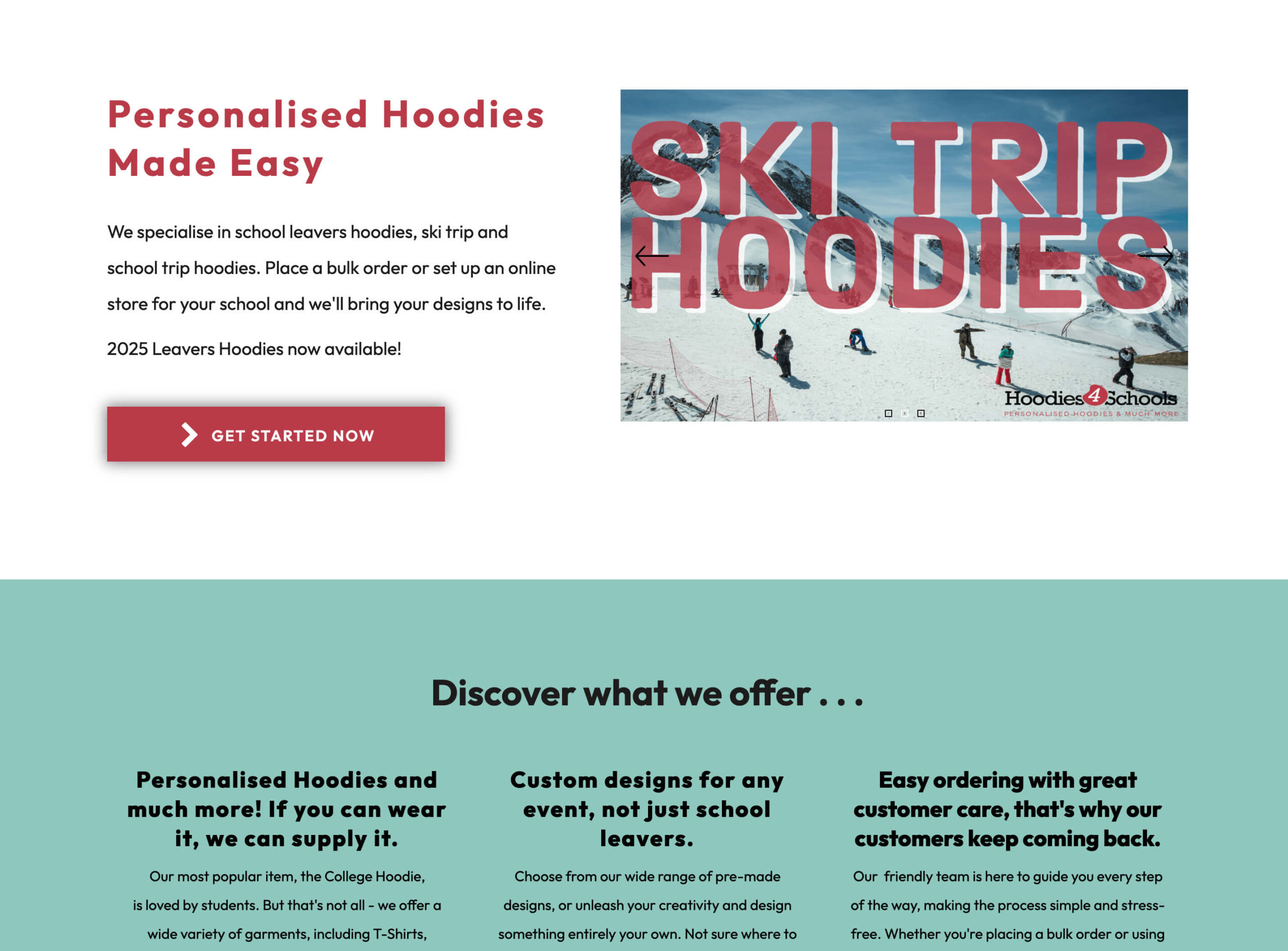
- Elements feel cramped; sections need more breathing room.
- “Discover what we offer…” is unbalanced – lacks symmetry and consistent spacing.
Brand and Colour

The turquoise shade clashes with the red and cheapens the overall brand impression. We’d recommend using the dark grey rgb as a secondary colour and the red as an accent colour. A refined palette = stronger, more trustworthy identity.
Suggestion
Brand video – show the production of the hoodies, insight to company and behind the scenes on styled shoots – bring the products to life.
Navigation and CTA Visibility

‘Get in Touch’ is hidden behind a dropdown on smaller screens (<1400px). This discourages enquiries.
Before and After


‘Design Now’ should be a prominent button, positioned top-right, with a strong background colour to drive clicks.
Content Interactivity
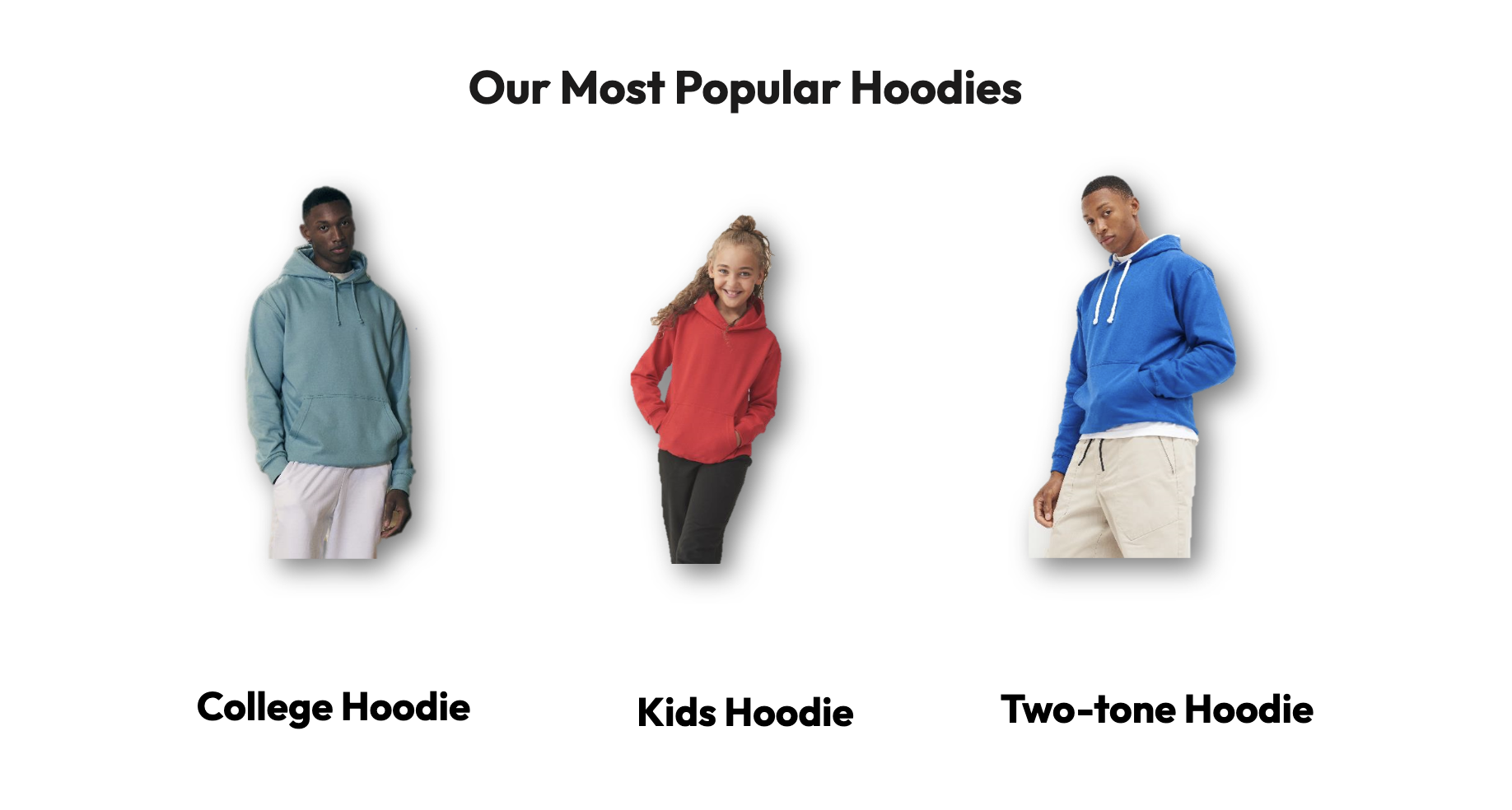
‘Our Most Popular Hoodies’ looks like a clickable section — but it isn’t. This creates frustration and weakens conversion.
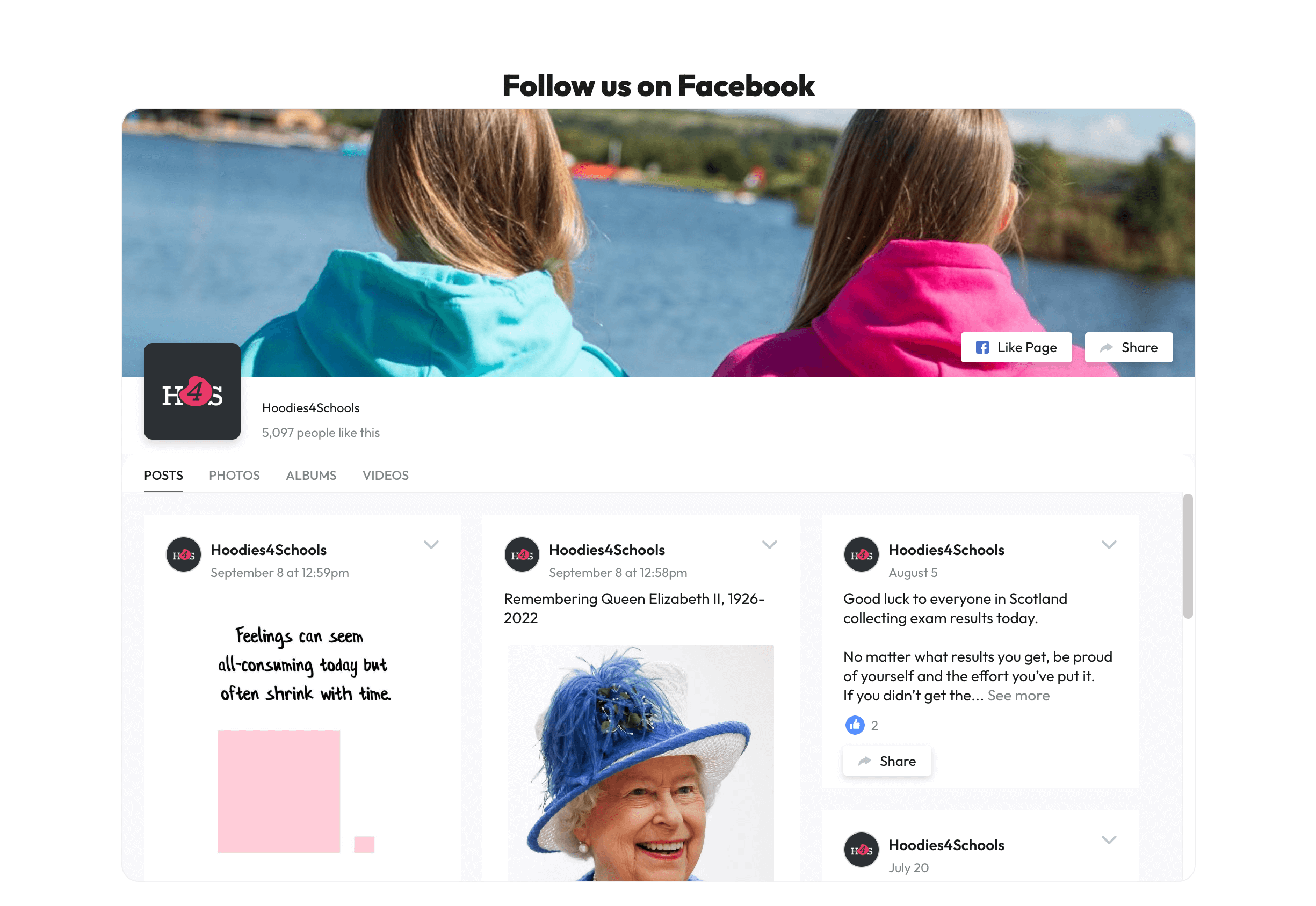
Facebook feed is oversized and clunky. A grid format (like the Google reviews) would feel more polished.
Pages and Process
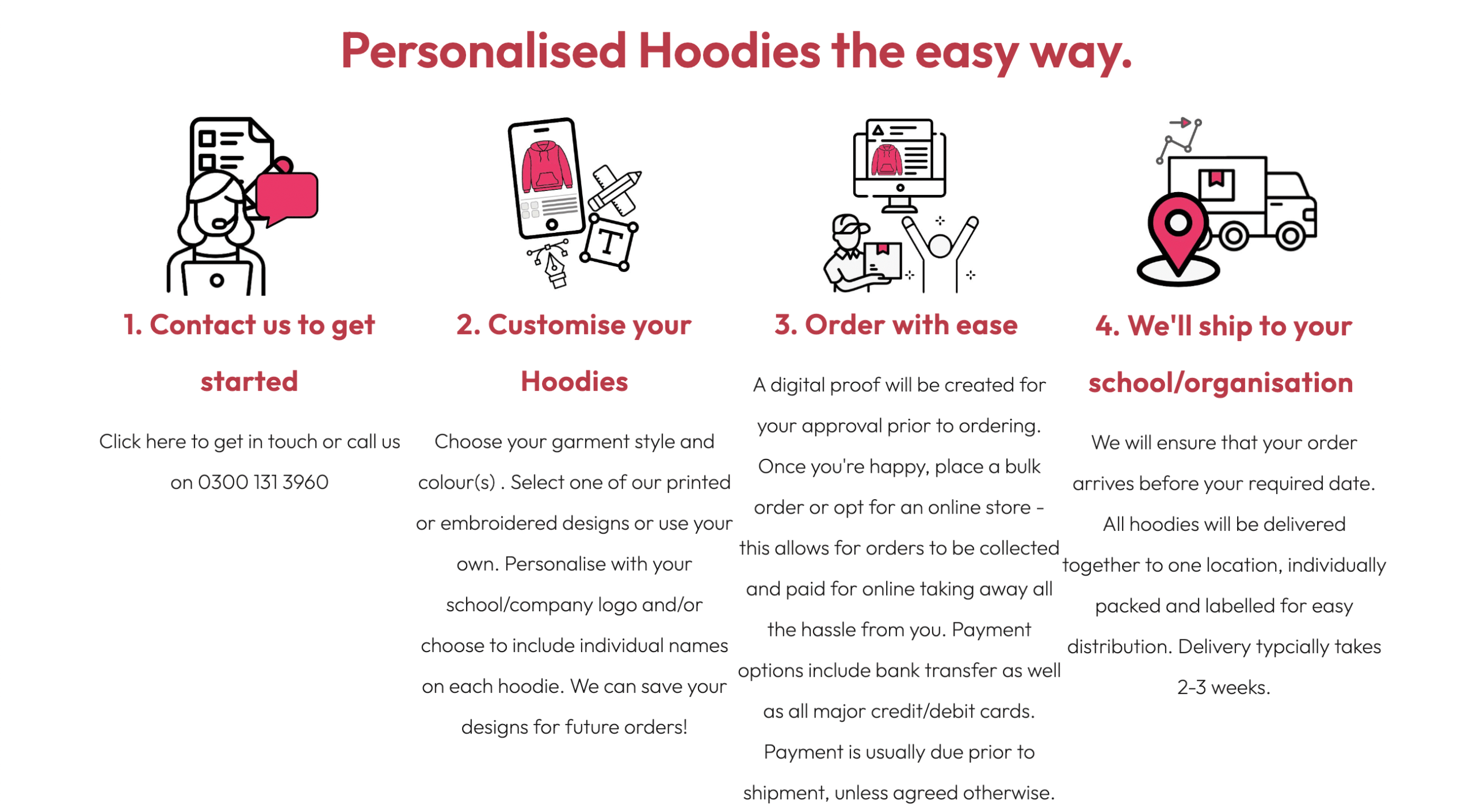
‘How to Order’ could be visually improved — steps 1–4 designed as a clear, graphical process (rather than plain text).
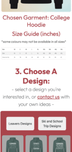
‘Design Now’ (embedded iframe) doesn’t scale well on mobile, feels cramped, and lacks visual breathing room. Even if limited by the embed, the surrounding layout can be improved.

High-Impact Fixes
- Rework layout spacing → instantly more premium, less cluttered look.
- Update colour palette → stronger, more professional branding.
- Elevate CTAs (Design Now button + visible Get in Touch) → improved conversions.
- Polish key sections (Popular Hoodies, How to Order, Facebook feed) → smoother, more trustworthy UX.
- Address mobile issues → especially the “Design Now” tool.