Pendle Bike Racks
Introduction
A branding project to appeal to the off-road riders

Challenge
Pendle Bike Racks wanted a brand to showcase the ruggedness and durability their bike racks had to offer.
Solution
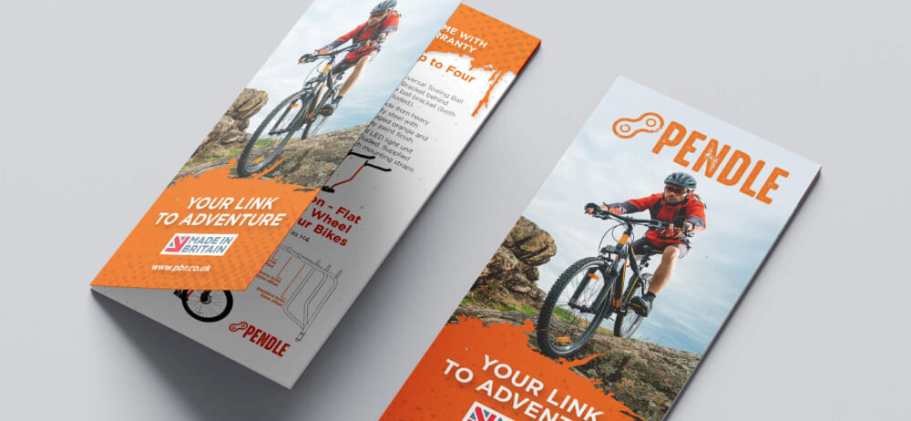
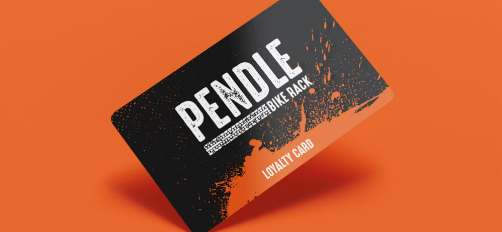
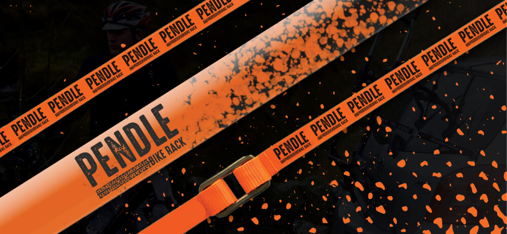
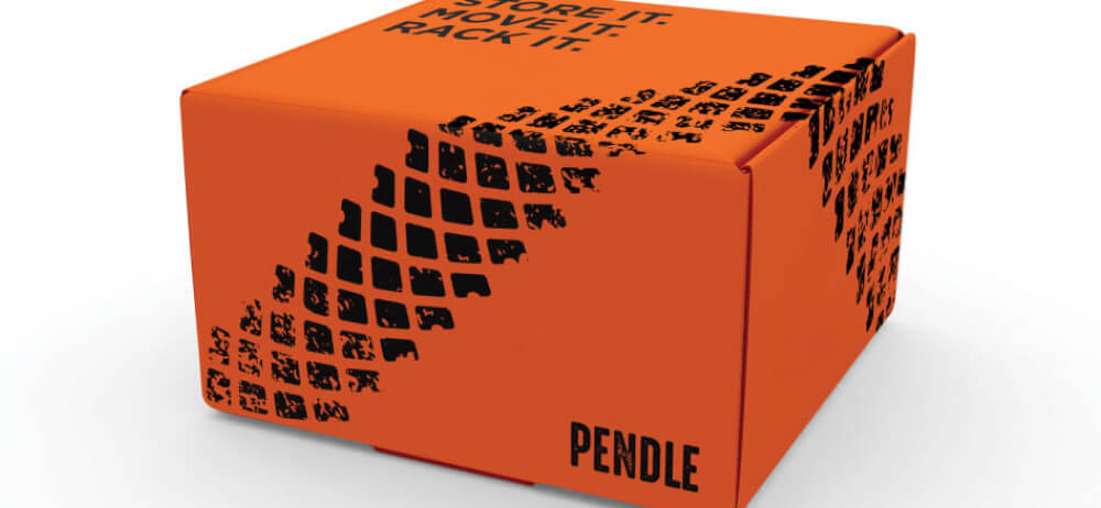
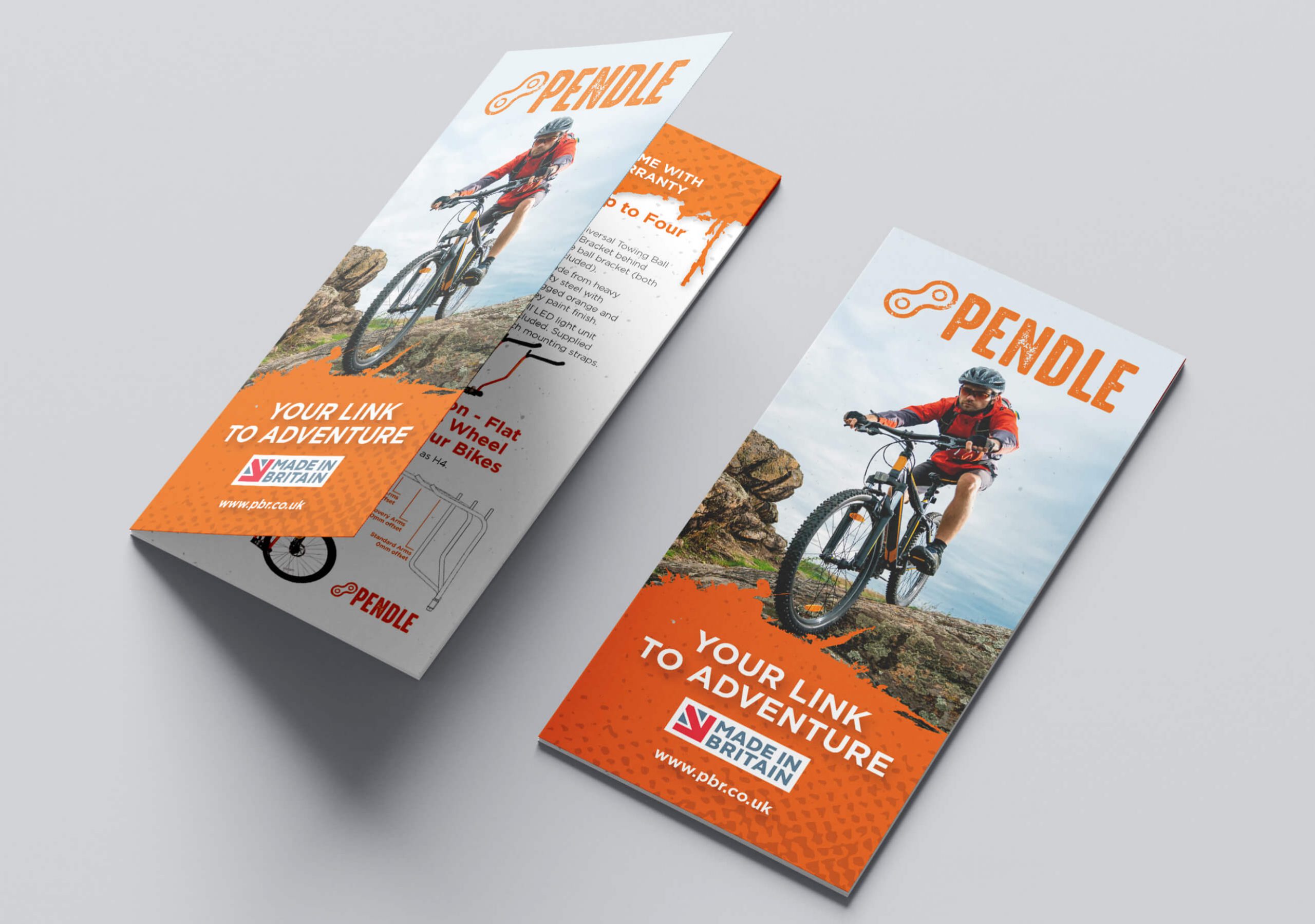
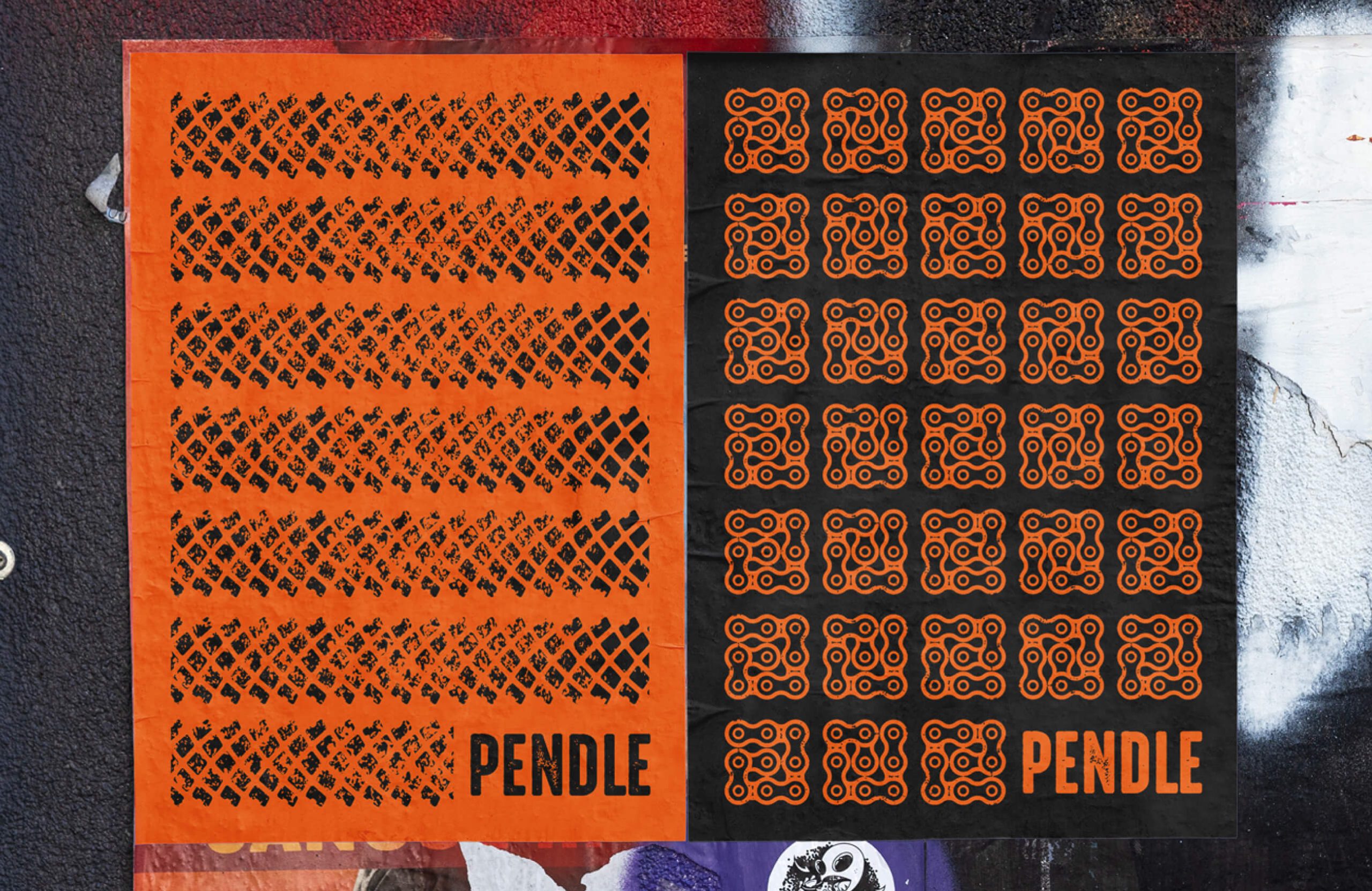
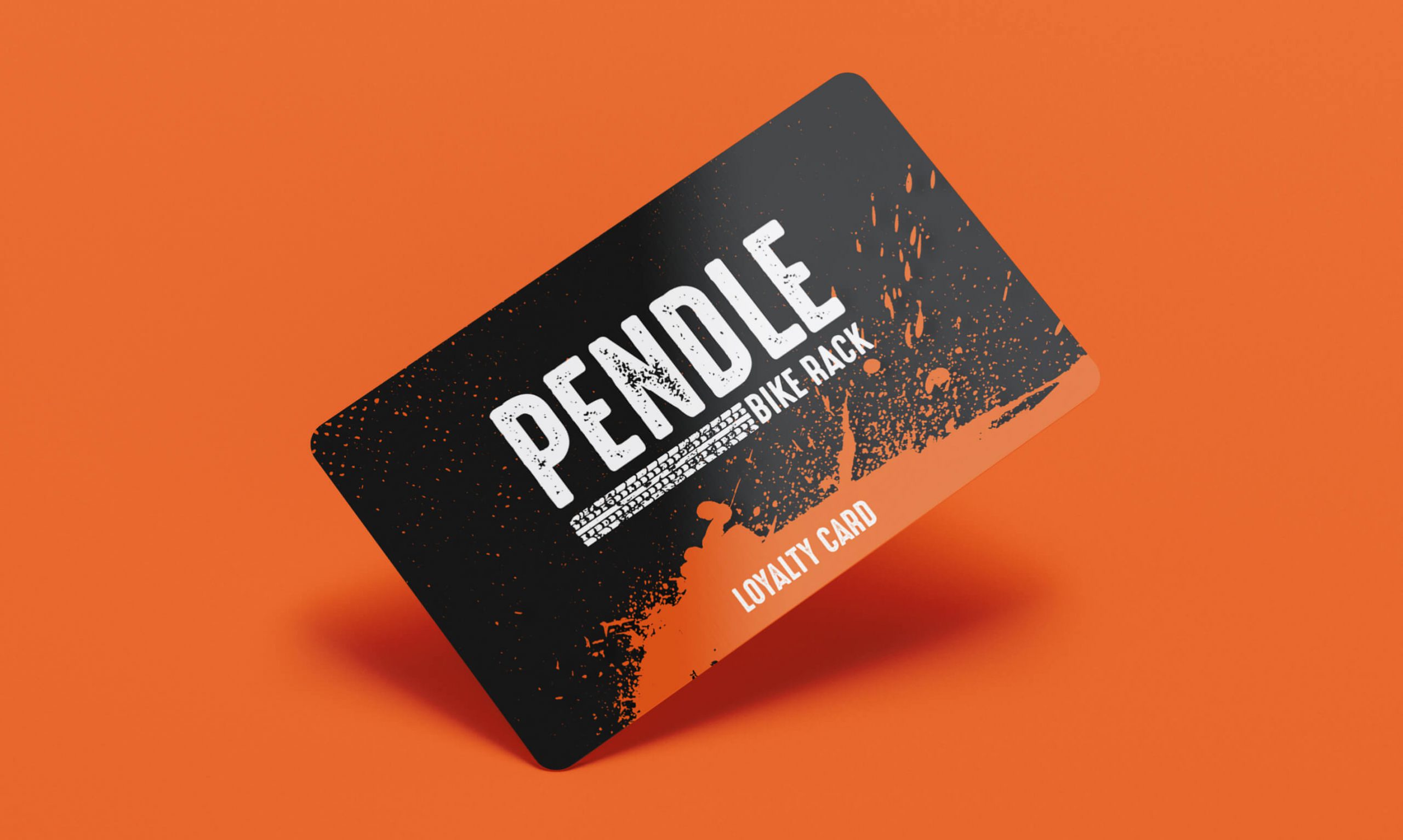
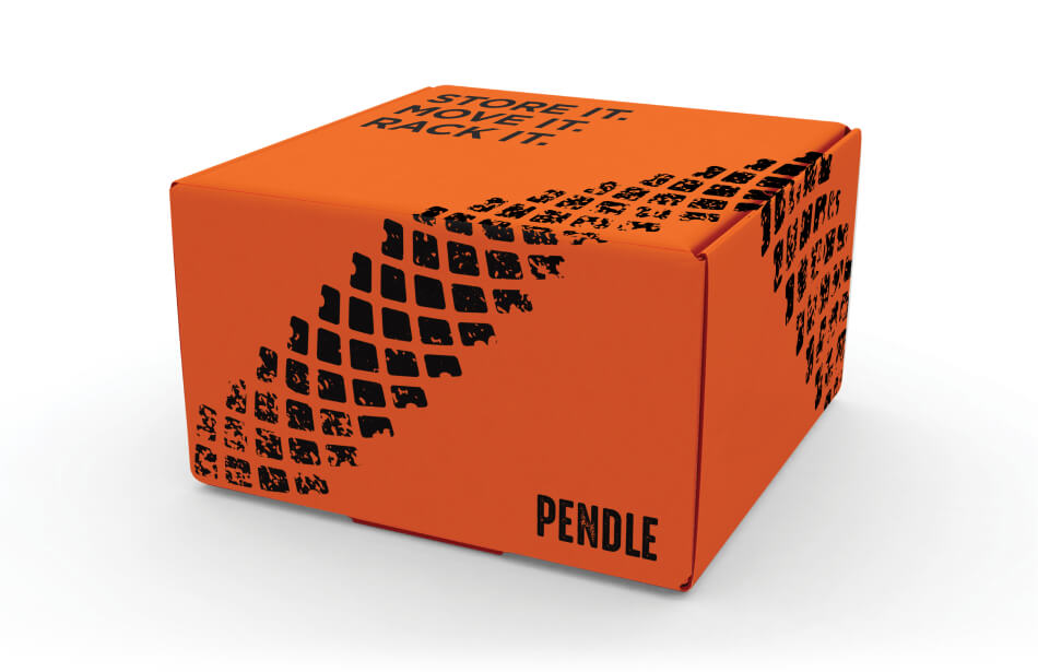
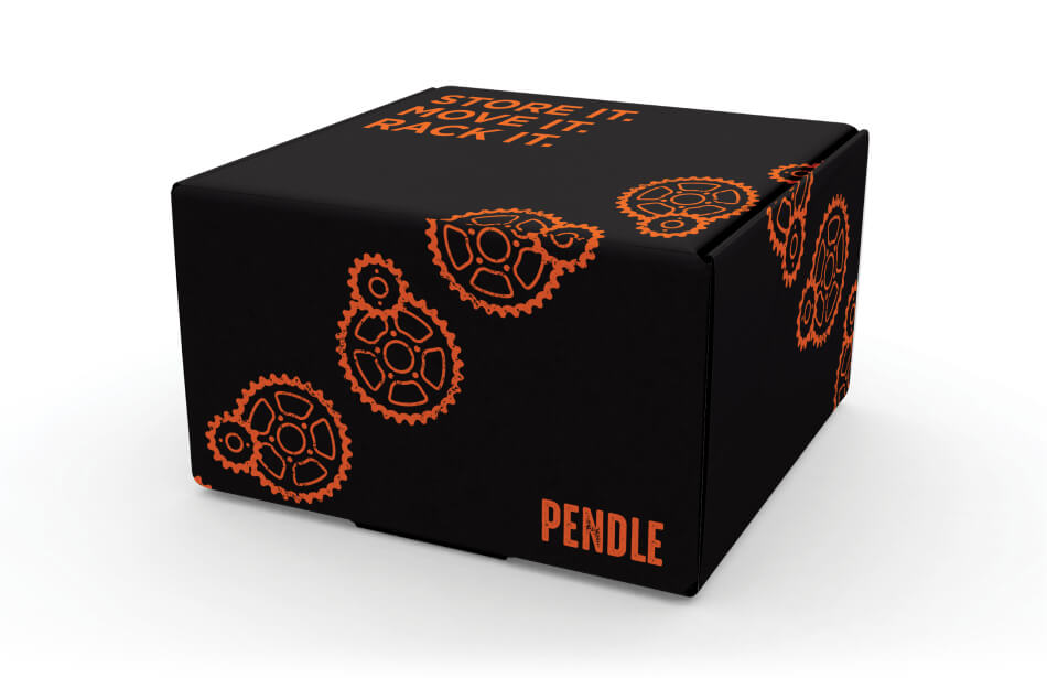
Media Village developed a brand that reflected their product. A distressed logo type reconnects the brand with the natural environment whilst a bold, orange colour ensures that Pendle Bike Racks are identifiable amongst competitor brands.


More Projects
What next?


Brysk
Brysk


Whalley Warm and Dry
Whalley Warm and Dry

BBR Optometry
BBR Optometry

Stonyhurst College
Stonyhurst College